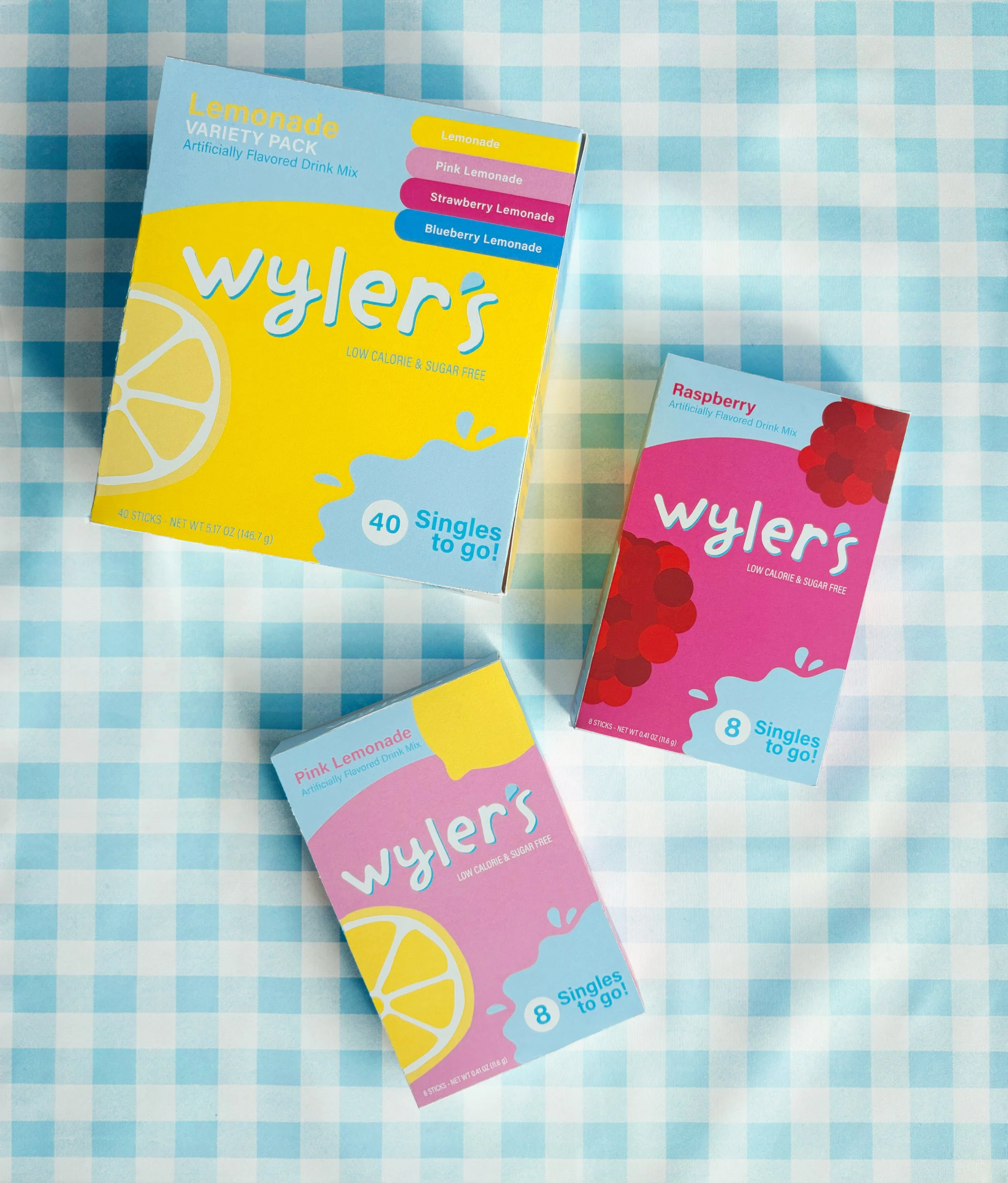
wyler’s light rebrand
OBJECTIVE: Choose an existing food or beverage brand that I believe was in need of a conceptual rebrand.
TOOLKIT: LOGO DESIGN, PACKAGING DESIGN, BRANDING
Wyler’s Light is a low calorie drink mix committed to helping their customers stay hydrated with flavor packets that make water much more exciting. My rebrands mission was to blow plain water out of the water! Its existing packaging felt dated and not appealing to a younger consumer.
I chose to drop the Light in the name - Wyler’s is catchier and less of a mouthful. The new packaging design is less cluttered, more modern, and would stand out on the shelf against competitors like Mio and Crystal Light.


